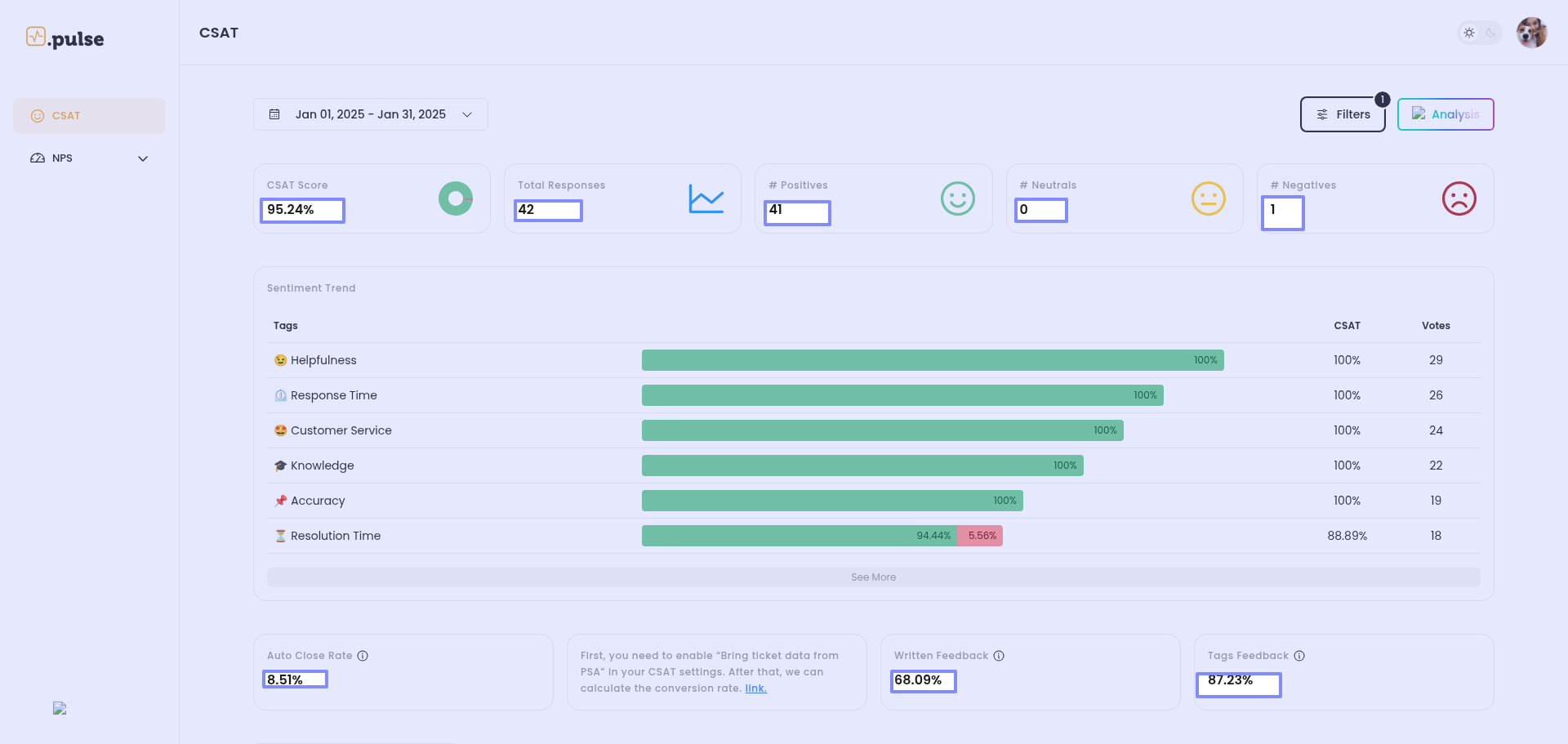
UI improvements - main KPIs are in too small a font
The main KPI numbers, are too small. IMO they should be almos as big as the icons (the faces and the donut chart). I have a better experience with the old Crewhu CSAT Details report because of that.
No comments yet
Be the first to share your thoughts.